Typeface Scales Up, Keeps in Step with HTML5

I’ve been asked about the small insignia at the bottom right corner of this page: It is the Typekit logo!

There have been some exciting developments in typography for digital publishing recently.  HTML5’s arrival permits the true ability to render typeface online. It is known as the WOFF standard. Google’s Chrome browser version 6 supports WOFF, and as of September 21, so does Typekit. Typekit offered WOFF support for Internet Explorer 9, still in beta, since the middle of September. N.B. Many WordPress sites use Typekit fonts. I don’t know if there is a contractual relationship between the two. I am appreciative of Typekit’s free font service for my WordPress.com budget blog.

This is a nice example comparing Windows versus Mac O/S. Better vertical metrics result in greater consistency across platforms:

Typekit updates with WOFF for Mac

Before and After Updated Vertical Metrics for Mac Fonts via Typekit Blog

Here you can see the improvement due to better rendering that comes with a WOFF-supported browser and typefaces:

Typekit updates rendering for Internet Explorer

Anticipate Better Rendering in Internet Explorer 9 via Typekit Blog

Enjoy some all around spectacular-ness: From the Lost World’s Fair site!  The image is a lush, multi-font fantasy of World’s Fair 2040. It is beautiful.

More details are available

via the Typekit blog:Adobe fonts, now with improved metrics and rendering In keeping with our strategy of constantly iterating and improving our font library, we have updated the following… Read More

Published in: on 1 October 2010 at 3:34 pm  Comments (4)  
Tags: , , , ,

Update: Type is Art to Take With You

Parts Of A Character product from Zazzle

Parts of A Character U.S. Postal Stamp

The Type Is Art interactive site, which I was introduced to by via ProArt on Twitter, has a store on Zazzle. There are some delightful and truly original products here, and they are actually made by Susanne Cernha of Silo Designs, who is associated with the Type Is Art project.

Unlike most of the promotional product pages that link to many blogs and fan websites, this one is not a tired old recycling of the same t-shirts, porcelain mugs and canvas bags with a logo stamped on the front that I see everywhere. Update 17 Aug 2010: There are plenty of t-shirts, porcelain mugs, canvas bags and baseball caps on Zazzle, I just hadn’t found them when I wrote this post. However, that doesn’t extend to the TypeIsArt site.

Parts of a Character is a bona fide U.S. Post Office stamp. Denominations are U.S. First Class (first and second ounce) and U.S. Priority Mail < 1.0lb.  Update 17 Aug 2010: I was incorrect about quantity purchase requirements. They are not huge, but pricing is in fact based on order quantity. Another plus: there are no huge bulk purchase requirements.

I found another data-related site at Zazzle, the pleasant ethnographers from Floating Sheep. I’ll take the liberty of cross-linking to Ellie Asks Why Annex on Blogger, and my post about geo-tagging and Microsoft’s Tag application. It offers a curious opportunity for creating linkages between the physical world and the interwebs.

Published in: on 2 August 2010 at 1:05 am  Comments (2)  
Tags: , ,

Science Tattoo Emporium

Discovery Magazine’s dizzying assortment of blogs include The Loom, written by science author and Yale lecturer Carl Zimmer.  I’ve culled a few of my favorites from his gallery of science-themed tattoos, The Science Tattoo Emporium. There are over 150 images, with each tattooed scientist, engineer, mathematician or wannabe explaining his or her tattoo’s meaning and personal significance.

Chemistry PhD from Cornell Tattoo: C. writes

I got this tattoo as an homage to the pain of my graduate work. It’s a model of fulvic acid which is a representation of natural organic matter in the soil. I work with this molecule for my grad work and I figured I might as well get it etched into my skin so I can look at it and say, ‘Well, at least it hurt less than grad school at Cornell.

Organic Chem PhD at Cornell

MM, Quartermaster 1st class, USN, writes: “I have been fortunate enough to be paid by the government to get ships from pt. A to pt. B serving in the US Navy…. I was drawn to navigation when I joined. In my opinion, it is the only job in the military that is both a science and an art…. it is important for Navigators to remain proficient in the old ways to fix a ship’s position using a sextant and trigonometry. My tattoo is the visual depiction of how to plot a line of position from a celestial body using the altitude intercept method… it serves as a reminder that while technology improves, the sea remains an unpredictable place….”

Celestial Navigation Tattoo

Power of Science in Living Color

Alan writes:
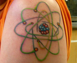
“After much consideration, I decided to get an atom tattoo. But what atom? Given that I’m an graduate student in organic chemistry at the University of Michigan, carbon seemed like the obvious choice. It also has the advantage of being small enough not to look too crowded. I went for a retro 50’s Jetsons sort of look. Believe it or not, the general shape (though not the coloring) is based on a piece of Microsoft Office clip-art.”

Power of the Atomic Tattoo

Carbon Atom Tattoo

Published in: on 25 July 2010 at 5:27 am  Comments (3)  
Tags: ,

Evolution of Modern Art

Here is a chart of the evolution of early 20th Century modern art, as represented by Mr. Alfred H. Barr, Director of the Museum of Modern Art (MOMA), from 1929-43. It is an example of data visualization, art deco-styled, during a time when art deco was not retro, but very current.  It is also unusual by virtue of its subject matter.  This is not merely an aesthetically appealling graphical image. It is artful data visualizaton, whose subject matter is also art! 

I would like to consider this more than an infographic, although I am admittedly on thin ice. However, this is a flow chart representing the evolution and associated taxonomy stucture used to categorize the inception of Modern Art as many of us think of it, as Cubism and Abstract schools developed after the post-Impressionism that ended around the time of World War I. It demonstrates how each independent style was a reaction to past style.  Excerpts from Alfred H. Barr’s catalogue for the exhibition “Cubism and Abstract Art  at the Museum of Modern Art, New York, in 1936”, see www.madamelamb.com for source data and further details of exhibit. 

Cubism and Abstract Art

Published in: on 25 April 2010 at 10:55 pm  Leave a Comment  
Tags: